Client: Personal Project
My Role: UX, Visual
Tools: Figma, FigJam
Duration: 5 weeks

THE CHALLENGE
Staying Informed Shouldn't Feel Like a Chore
Live-service games are constantly changing, but keeping up with those changes takes work. Players often have to search across multiple platforms, read lengthy patch notes, and interpret technical information just to understand what has changed. For players returning after a break, that information can quickly become overwhelming.
DISCOVERY
How Are Players Keeping Up Now?
Before designing a solution, I looked at how updates are currently communicated and where the experience breaks down.
Looking at the Existing Landscape
I analysed Discord, Steam, and GameTrack to understand how players currently discover and manage updates.
01 — Fragmented Information
Updates are spread across game pages, communities, launchers, and other platforms.
02 — Information Overload
Patch notes are often presented in full, with little support for quickly identifying the most important changes.
03 — Limited Personalisation
Existing platforms distribute updates, but rarely explain which changes are most relevant to an individual player.
USER RESEARCH
I Wanted to Know What Players Struggled With
I interviewed 6 players of live-service games to understand how they keep up with updates, what happens when they take a break, and where the current experience creates unnecessary effort.

Key Findings
100%
used multiple sources to stay informed about updates.
100%
wanted updates that felt more relevant to them.
83%
described patch notes as too long or overly technical.
The Pattern Was Clear
Players didn't necessarily need more information. They needed a better way to understand the information already available to them.
This led to two questions:
01 — How might we make relevant updates easier to find and understand?
02 — How might we reduce the confusion created when updates are spread across multiple sources?
DEFINING THE PRODUCT
Finding the Opportunity
Before deciding what PatchScope should become, I mapped user needs against business goals and project constraints.

This helped narrow the concept around three priorities:
01 — Centralise
Bring updates from multiple games into one experience.
02 — Simplify
Turn lengthy, technical patch notes into concise summaries.
03 — Personalise
Help players understand which changes actually matter to them.
THE SOLUTION
One Place for the Updates That Matter
PatchScope brings updates from multiple live-service games into one personalised experience.
AI-generated summaries explain what changed, while personalised insights help players understand why it matters to the way they play.
Instead of searching through patch notes, community posts, and multiple platforms, players can quickly catch up and get back to playing.
MAPPING THE KEY JOURNEYS
Turning the Idea Into a Product
I created a user flow to understand how players would move through key experiences before committing to individual screens.

USABILITY TESTING
The Prototype Revealed Some Problems
I tested an interactive high-fidelity prototype with the same 6 participants from the research phase. These findings helped shape both the final experience and opportunities for future development.
The core concept worked:
100%
successfully completed every task flow without moderator assistance.
100%
found the simplified AI summaries easier to understand and responded positively to the clearer information hierarchy.
The test also revealed opportunities that went beyond basic usability:
83%
wanted a more detailed playstyle quiz.
67%
wanted the option to skip the quiz during onboarding.
50%
wanted greater control over how AI personalisation influenced their updates.
THE FINAL EXPERIENCE
How Does the App Work?
Getting Started, Without the Overload
Onboarding helps players set up their games and preferences so PatchScope can tailor the experience from the start.


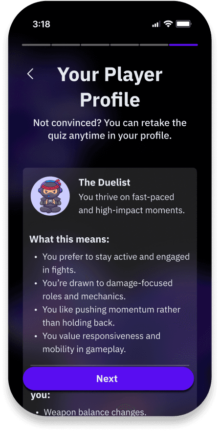
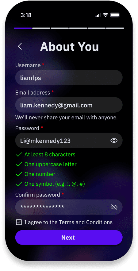

Making Patch Notes Easier to Understand
Long patch notes are condensed into concise AI-generated summaries, allowing players to quickly understand the most important changes. Personalised insights add context based on the player's preferences and playstyle, helping distinguish between what changed and why that change matters.


VISUAL DIRECTION & BRANDING
Building an Identity Around Clarity
A style guide used to create a cohesive, consistent experience across PatchScope.
Colours

Typography

Icons (at 32px)

PROTOTYPE
Creating an Account

Explore the App

BEYOND THE MVP
Where PatchScope Could Go Next
Testing validated the core idea, but it also revealed opportunities for PatchScope to become more adaptive and user-controlled.
01 — Adaptive Personalisation
Future versions could learn from the games and updates users actually read, save, and interact with, allowing recommendations to evolve beyond their initial onboarding preferences.
02 — Social Features
Shared game libraries, friend activity, or discussions around major patches could give players reasons to engage with PatchScope beyond simply checking updates.
Reflection
PatchScope challenged me to think beyond individual screens and consider how an entire product could evolve over time. Testing showed me that personalisation only adds value when users understand what it is doing and feel in control of it.
The project also reinforced the importance of iteration. Several features that made sense conceptually became confusing once placed in front of real users, and the strongest parts of the final experience came directly from responding to those moments of friction.

What I Took Away From the Project
01 — Transparency builds trust in AI.
Users were more confident in personalised content when they understood how it worked and had control over it.
02 — Simplifying information isn't enough.
Players didn't only need shorter patch notes. They needed context that helped them understand why a particular change mattered to them.
03 — Designing for growth starts early.
Building reusable components and a scalable system helped ensure PatchScope could accommodate more games, update types, and features beyond the initial MVP.